How to create same navbar for mobile same as desktop in WordPress (Divi)
How to create same navbar for mobile screens same as desktop screen? By default every WordPress site will have hamburger menu for mobiles. What if we need to disable that hamburger and view all menu items same as desktop menu.
Step 1 – Removing hamburger menu for mobile
We need to inspect where is the css of hamburger so that we can remove it. In the example I am using website with Divi theme builder, this works for all kinds WordPress sites even without theme builder.
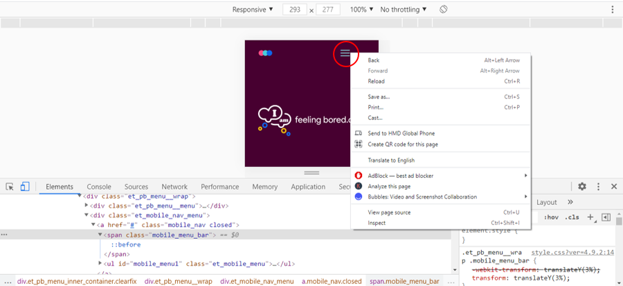
Open chrome and view your website in mobile size. Select hamburger and right click > select inspect you find the hamburger’s css class which is mobile_menu_bar (for every Divi website it will be the same)
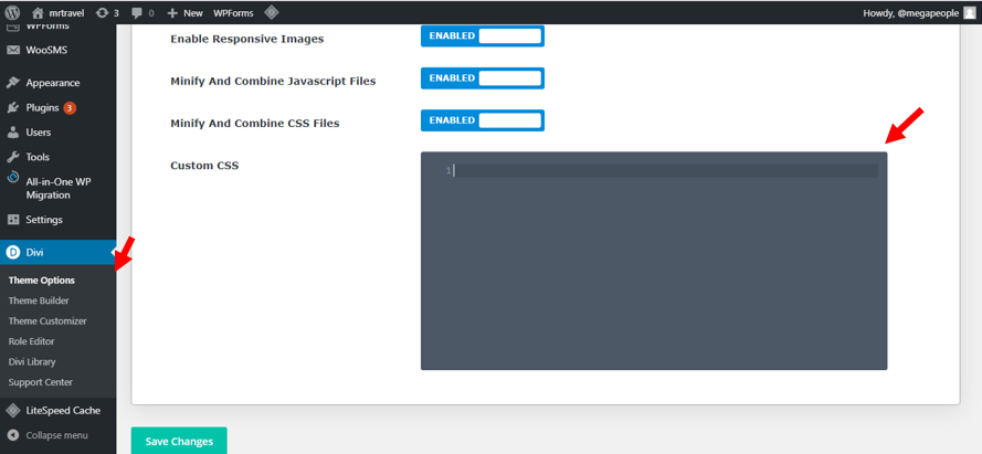
Now add some css in Divi theme options (this is where you can add your css)
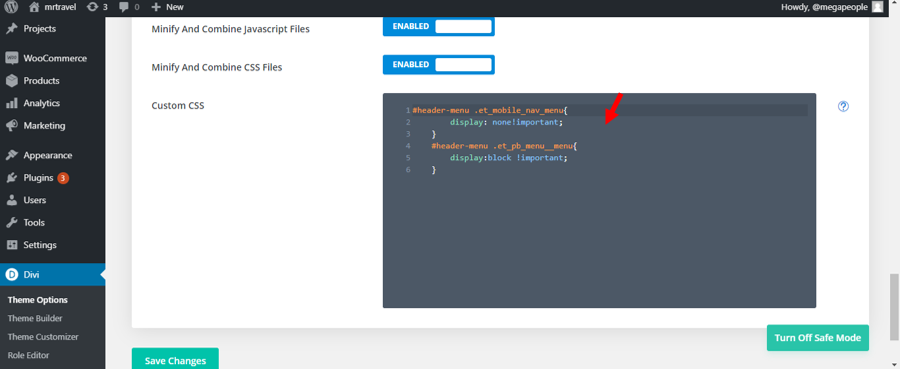
Target the id header-menu and the class et_mobile_nav_menu and add this css, here we have set hamburger menu to be none to make it disappear.
#header-menu .et_mobile_nav_menu{
display: none!important;
}
Step 2 – Make Menu items visible
After hiding hamburger icon, we will make all menu items visible.
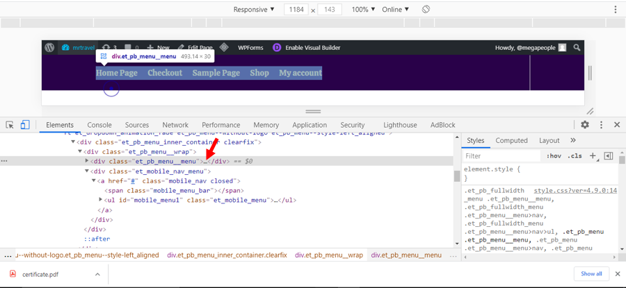
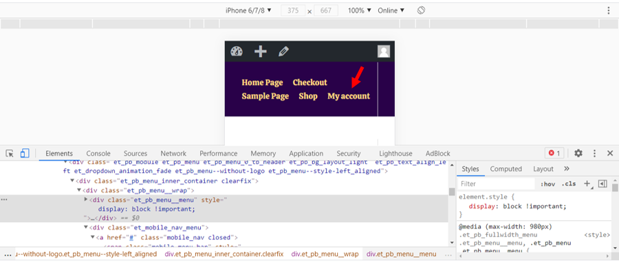
So first we need to find out the container div where all menu item are contained
Target menu items and make them appear by giving display block property
#header-menu .et_pb_menu__menu{
display:block !important;
}
Summary
Add this snippet of code in custom css field and you will see the magic and all of the stuff mentioned above is to explain how it works in css.
This is all you need to add
#header-menu .et_mobile_nav_menu{
display: none!important;
}
#header-menu .et_pb_menu__menu{
display:block !important;
}
You will see that all menu items are appearing in mobile view as well. Now you can change menu items text size accordingly and make your menu bar look beautiful.
