How to create amazing revealing footer in WordPress or Divi
Do you want to create amazing effect using wordpress or theme builder Divi? Here is how to create amazing looking footer which reveals after main section.
You can follow this method for any wordpress site with or without theme builder like Divi or Elementor. If you cannot understand the basic css just copy the code(only incase you are using Divi theme builder as I have used Divi for explaining)
Step-1
Inspecting your web page.
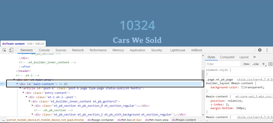
To inspect a web page you need to right click on page and select inspect. You will find the sections of content like shown in screenshot.
You have to find out for main section. This is the main section of the page.
Note: Every webpage has three main parts in its body header, main and footer.
Step-2
Now what we need to do is we will leave the margin at bottom (of main section) which will be equal to the height of footer.
Add this code targetting main section
#main-content {
position: relative;
z-index: 1;
margin-bottom: 340px;
}
I have given the margin of 340px (because it is height of the footer)
And z-index of main section will be 1 so that it will be above the footer and relative pasition as we have margin at bottom.
Step-3
Now we have to make footer fixed at its position so that it cannot move and only main section will move on scrolling which is above the footer.
footer {
position: fixed;
z-index: -1;
height: 340px;
bottom: 0;
left: 0;
right: 0;
}
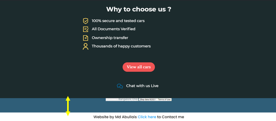
I have given z-index of -1 to the footer so that it would be under main section (which is having z-index of 1). Now footer is fixed at its position and only main section will move from above and create a revealing effect for footer. Like this
One Extra Step:
The height of footer is given according to desktop size and the height of footer would be different for tablets a mobile device. Now you have two options
1- Leave this revealing effect for desktop only by adding media query only for desktop.
2- Check what the height of footer for small devices is and add a different height for footer with the media query for these devices.
I am choosing second option.
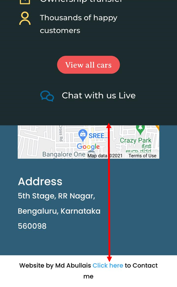
Check out what size is required for footer in small device in my case I have found it to be 600px.
@media(max-width:820px){
#main-content {
margin-bottom: 600px;
}
footer{
height: 600px;
}
}
Change bottom margin and height of footer together.
Now the footer effect will also be visible in mini devices as well.
